KKBOX Group visual identity
2017 ~ now
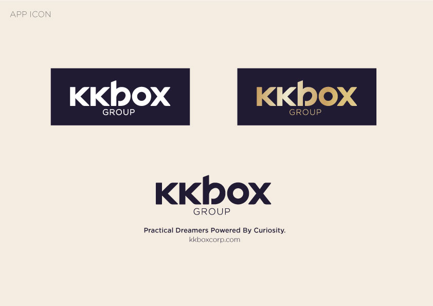
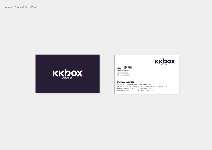
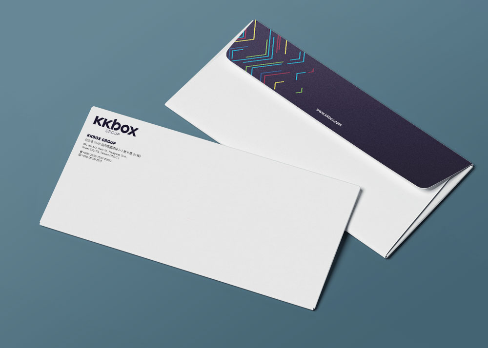
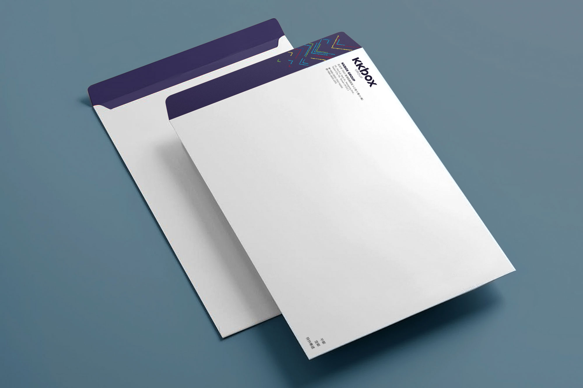
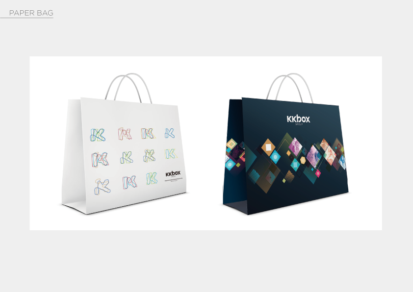
As KKBOX growing bigger and bigger, it decided to re-organize as a Group. Hence KKBOX Group was born. The logo kept the original shape of famous KKBOX logo for people to recognize instantly, we only adding “Group” underneath in order to differentiate.
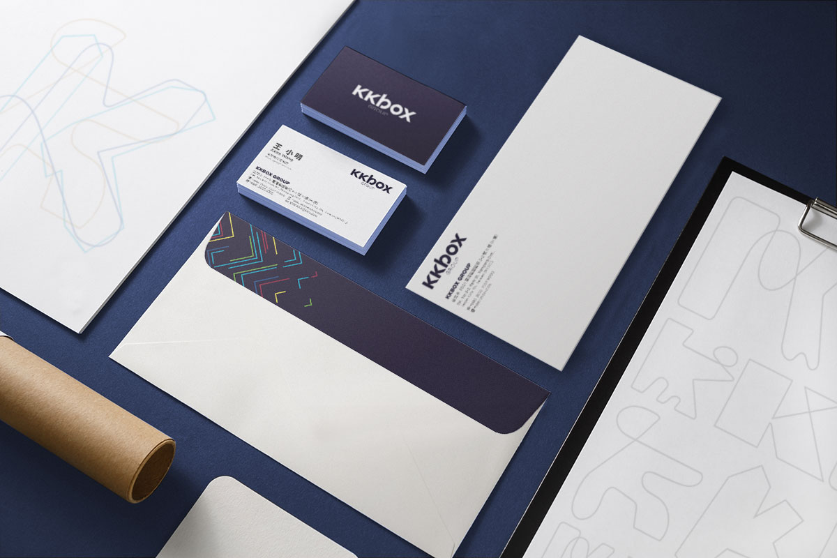
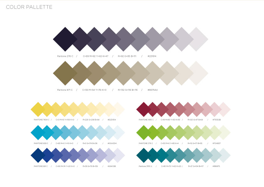
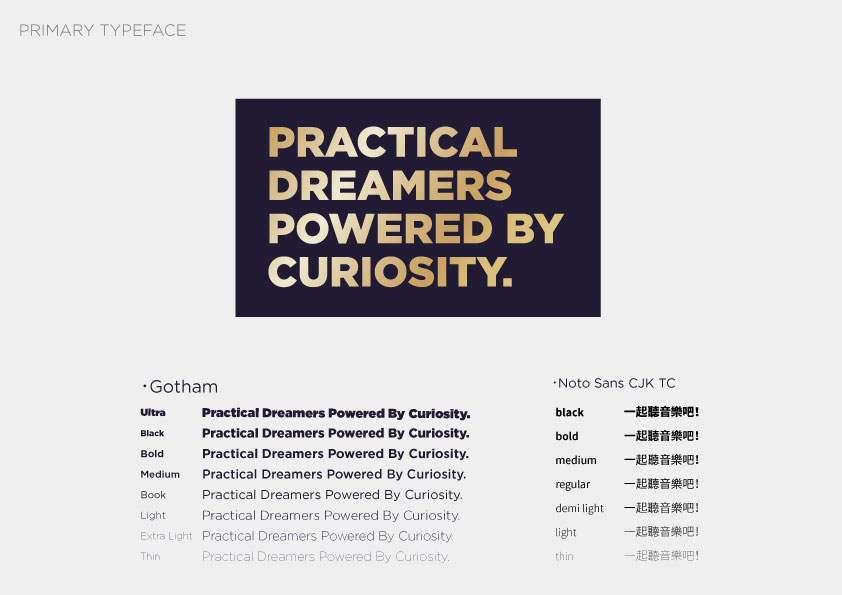
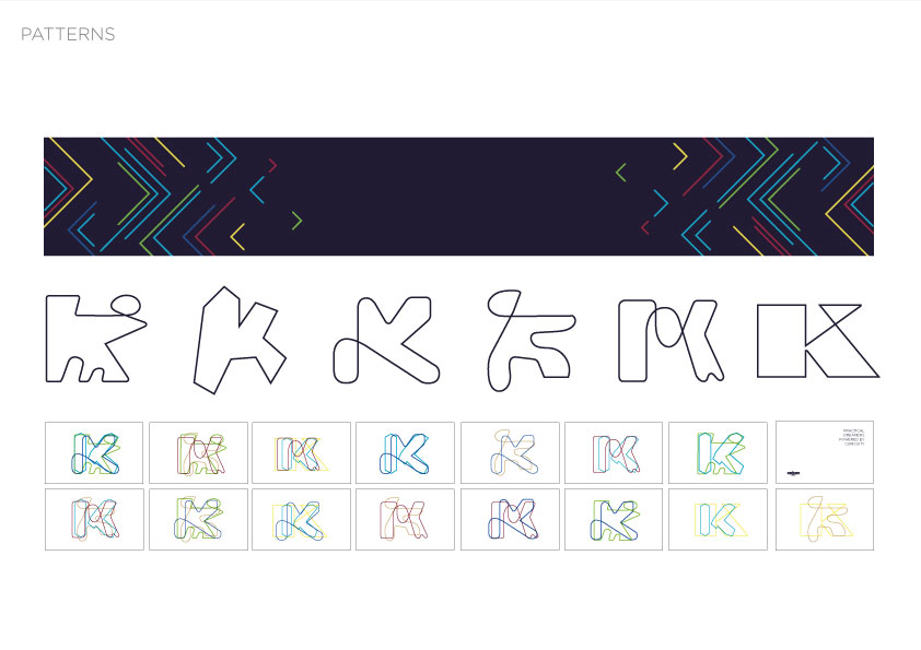
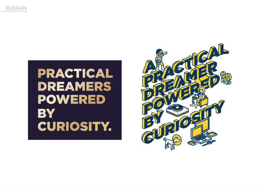
The purpose is to create a new design system to show that the group is honest and reliable. Therefor the color palette, typography, and most important the pattern should be solid but also able to show running various businesses.


